L'Heure Bleue (eng. The Blue Hour) from the french brand Guerlain is considered to be on of the first commercially successful perfumes. The name 'The Blue Hour' derives from the phenomena when the sky gets soaked in a blue, warm color at dusk, which has to do with the sun's wavelengths during this particular time at day. My challenge was to come up with a new packaging and perfume bottle design, as well as giving life to a graphic identity suitable both for the brand and for the modern day customer.
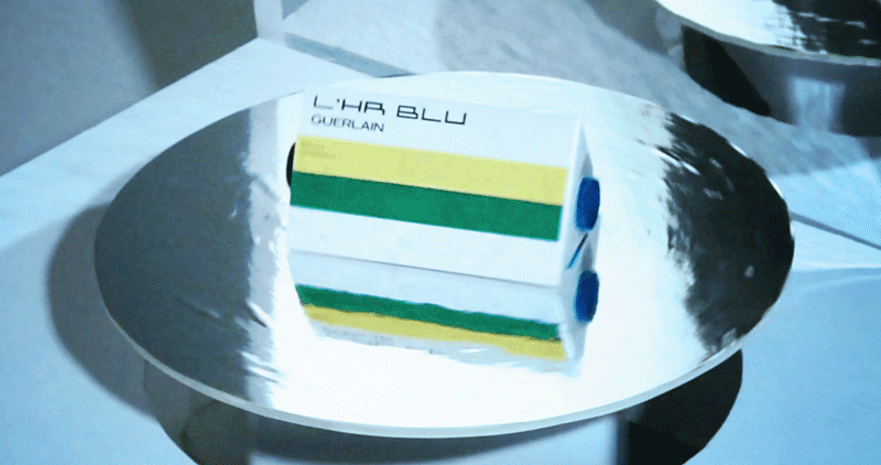
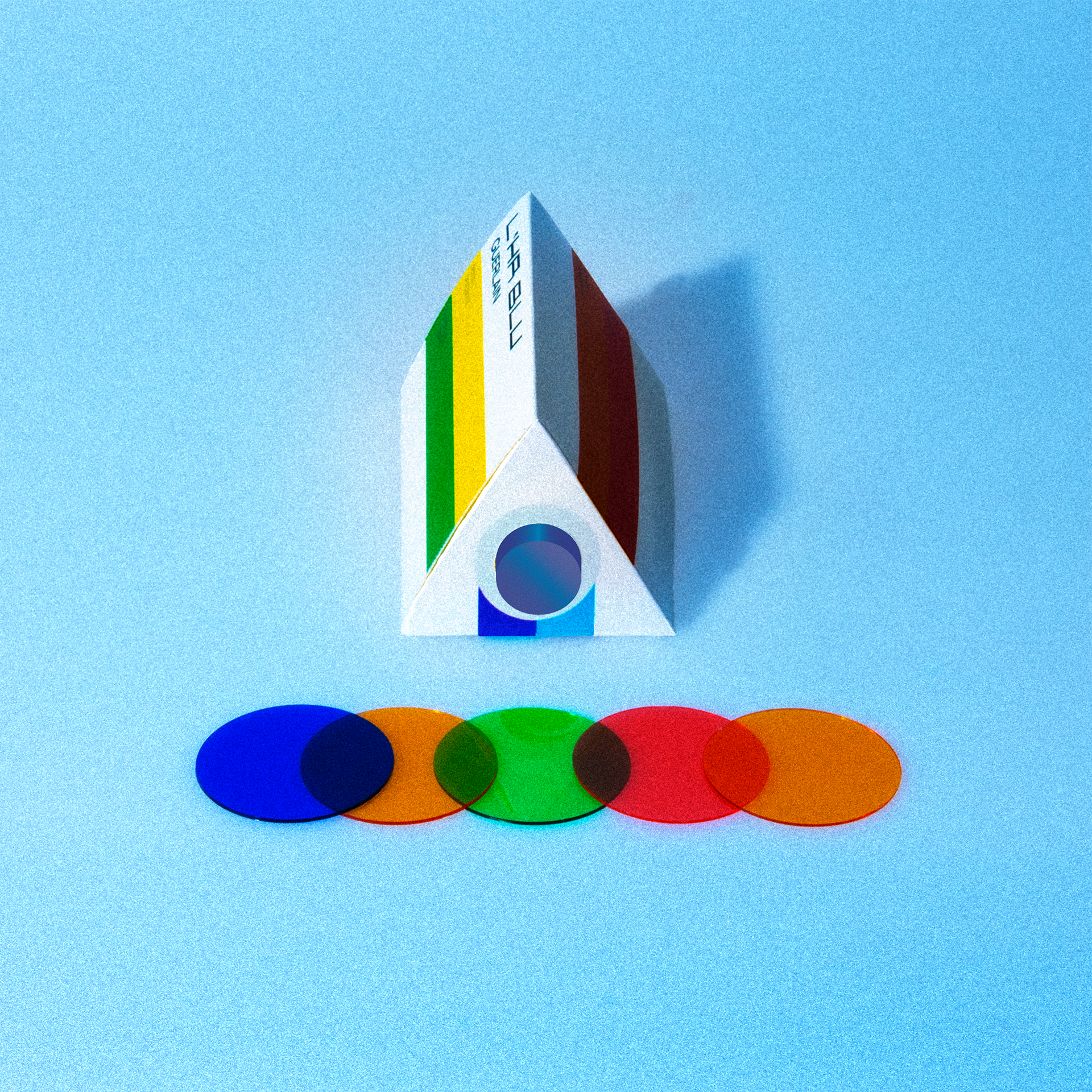
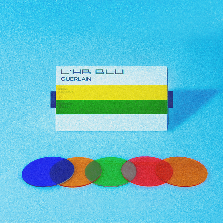
The colorful stripes on each side were supposed to represent the light broken into its essential colors – and also a way to display the different tones of the perfume. All in all, the packaging was an experiment to visualize light in an everyday product, and challenge ordinary square packaging deisgn in order to create something else.
Redesigning something so dear as the french, romantic and iconic perfume L'Heure Bleue gave me the urge to make something completely opposite. My approach was more technical than nostalgic. I wanted to play around with light, prisms, color filters and 60's and 70's packaging design. The result was a triangle shaped perfume packaging striped with the primary colors on all three sides. The cylinder shaped bottle in blue glass is placed through the container in order for the perfume owner to look through and see the world in blue.